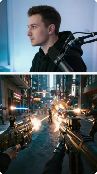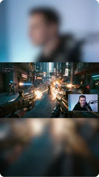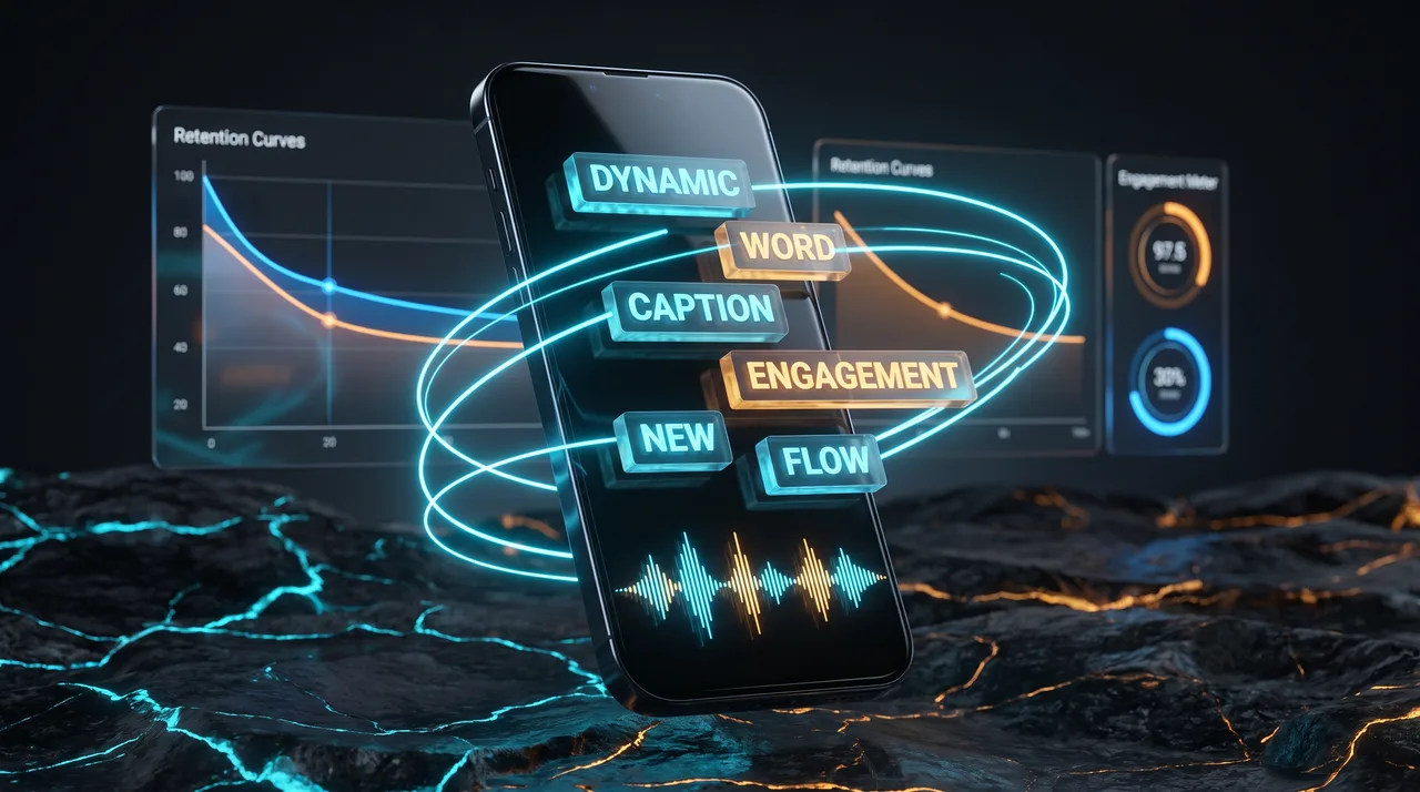
Animated captions can increase watch time, but mainly because captions themselves aid muted viewing and word-by-word timing anchors attention. The animation itself adds only a small boost. Heavy, flashy effects often hurt retention by creating friction. Prioritize readability and pacing over decoration, and test styles against your own retention data.
If you've spent any time studying viral Reels, TikToks, or Shorts, you've noticed a pattern: the words on screen rarely sit still. They pop, bounce, change color word-by-word, and sometimes shake for emphasis. The implied promise is that animated captions keep eyes glued to the screen and push your watch time higher. But is that actually true, or is it a cargo-cult habit creators copy because everyone else does it?
The honest answer is more nuanced than the hype. Animated captions can increase watch time—but the effect comes from a few specific mechanisms, not from animation for its own sake. Understanding those mechanisms lets you keep what works and drop the busy stuff that costs you nothing but render time.
What Animated Captions Actually Do
Before we talk retention, let's separate the layers. "Captions" and "animation" are two different variables, and lumping them together is where most creators go wrong.
- Captions themselves (any on-screen text of your spoken words) carry most of the measurable benefit. Roughly 80% of mobile video is watched muted at some point, so text is often the only thing communicating your message.
- Animation is the styling layer on top—timing, movement, color changes, emphasis effects.
When a case study claims "captions boosted watch time by X%," it is almost always measuring the jump from no captions to captions, not from static captions to animated ones. That distinction matters enormously, because it means the biggest win is captioning at all—animation is the smaller, secondary optimization.
The real mechanisms behind retention
Animated captions help watch time through three concrete effects:
- Attention anchoring. Movement on screen draws the eye. When a word appears exactly as it's spoken, viewers' focus stays on the content instead of drifting.
- Pacing cues. Word-by-word reveals create a subtle sense of forward momentum. The viewer feels the video is "going somewhere," which reduces the urge to swipe.
- Comprehension in silence. Highlighted active words make muted viewing effortless, and effortless viewing lasts longer.
Notice that none of these require elaborate effects. A simple word-by-word highlight delivers all three. The shaking, the rainbow gradients, the spring-bouncing letters? Those are decoration, and decoration has diminishing—sometimes negative—returns.
Do Animated Captions Really Increase Watch Time?
Let's answer the headline directly. Animated captions increase watch time when the animation reinforces comprehension and pacing. They do not increase watch time when the animation is purely cosmetic or, worse, when it distracts from the actual message.
The clearest way to see this is to think about what the viewer's brain is doing. Short-form retention is a running cost-benefit calculation: "Is the next second worth more than swiping to something new?" Anything that makes the content easier to follow tips that calculation in your favor. Anything that adds cognitive friction tips it against you.
Word-level timing (the word highlighting as it's spoken) tips things in your favor because it syncs text to audio and keeps the viewer locked in. But a caption that jumps around the screen, uses three fonts, and flashes colors forces the viewer to re-find the text every half-second. That is friction, and friction loses the swipe battle.
What the numbers tend to show
Controlled creator experiments—and platform-shared data—consistently land on a similar hierarchy of impact:
| Change | Typical effect on watch time |
|---|---|
| No captions → any captions | Large, reliable gain |
| Static captions → word-by-word animated | Small to moderate gain |
| Simple animation → heavy/complex animation | Flat or slightly negative |
| Adding emphasis on 1–2 key words per clip | Small gain |
| Constant motion on every word | Often negative |
The takeaway is a curve, not a straight line. Benefits rise fast when you go from nothing to clean animated captions, then plateau, then decline as you pile on effects. Most creators who feel "stuck" are operating past the peak—adding more animation and wondering why retention won't budge.
Where Caption Styles Make a Real Difference
Not all caption styles are created equal, and the right style depends on your content type. Here is where thoughtful choices genuinely help.
Match the style to the content pace
- Fast, high-energy content (comedy, hooks, reactions) benefits from quick word-by-word reveals that match the frantic pace. The animation mirrors the energy.
- Educational or calm content often retains better with phrase-level captions that stay readable for a beat longer. Rapid-fire single words can feel stressful against slow narration.
When the caption style fights the content's natural rhythm, viewers feel a subtle wrongness even if they can't name it—and that friction shows up in the retention graph.
Readability beats flair, every time
The caption styles that win share boring-sounding traits:
- High contrast between text and background (bold outline or solid box)
- A single, legible sans-serif font
- Text placed in the safe zone, clear of UI elements and the thumb
- Two to four words visible at once—never a full paragraph
If your animated captions are hard to read for even a fraction of a second, every fancy effect you added is working against you. Legibility is the floor; animation is the ceiling. Don't decorate the ceiling before you've built the floor.
Emphasis as a retention tool
One genuinely effective technique is selective emphasis: let most words appear plainly, but scale up or color a single punchline word or key number. This creates a visual hook without overwhelming the eye. The contrast does the work—if every word is emphasized, nothing is.
The Case Against Over-Animation
There's a reason "busy" is the word creators reach for when they critique bad captions. Over-animation creates specific problems that quietly erode watch time.
Cognitive overload. The brain can only track so much motion. When text bounces while the background cuts rapidly and a sticker spins in the corner, the viewer's working memory is spent on processing the screen rather than absorbing the message. Confused viewers swipe.
Perceived lower quality. Counterintuitively, maximalist caption effects can read as amateur or spammy, associated with low-effort reposts and engagement bait. If your content is trying to establish authority, aggressive animation can undercut it.
Accessibility costs. Flashing, rapidly moving text is harder for many viewers to read—including those with visual processing differences. Alienating a slice of your audience is the opposite of maximizing watch time.
Diminishing novelty. Early on, bouncing captions were novel and grabbed attention. Now they're everywhere, so the novelty bonus has largely evaporated. You're paying the cost of the effect without the attention payoff that used to come with it.
How to Test This on Your Own Content
Don't take anyone's word for it—including mine. Your audience and niche are specific, and the only data that matters is yours. Here's a clean way to test whether your animated captions actually move watch time.
Run a controlled comparison
- Take similar-performing content and publish one batch with your current caption style and one with a simplified style.
- Keep everything else constant—hook, length, posting time, topic.
- Compare average watch time and retention at the 3-second and 50% marks, not just views. Views are driven by the algorithm's reach decisions; watch time is driven by the content itself.
- Need a meaningful sample. Five videos per style minimum; more is better. One viral outlier can mislead you.
Read the retention curve, not the vibe
The retention graph tells you where people leave. If you see a drop right when a heavy animation effect fires, that's a signal. If the curve is smooth through simple captioned sections and dips during cluttered ones, your answer is on the screen.
Retention curve signals to watch for:
- Sharp drop right after a flashy effect  → animation is distracting
- Smoother curve with simple captions     → clarity is winning
- No difference between styles             → animation is neutral; simplify to save time
That last case is more common than creators expect. Often, simplifying captions costs zero watch time—which means the hours spent on elaborate animation were pure waste you can reclaim.
Practical Recommendations
If you want the short version of everything above, here's the playbook for using animated captions to actually support watch time rather than sabotage it.
- Caption everything. This is the non-negotiable, highest-impact move. Everything else is optimization on top of it.
- Use word-by-word highlighting as your default. It delivers the attention and pacing benefits cleanly.
- Pick one clean, high-contrast style and stick with it for brand consistency.
- Reserve emphasis effects for one or two key words per clip. Scarcity makes them land.
- Match caption pacing to content energy—fast for fast, calmer for educational.
- Cut any effect that doesn't aid comprehension. If it's just decoration, it's probably costing you.
- Test on your own retention data before committing to a new style across your library.
The honest bottom line
Animated captions are a real retention tool, but they're a modest one sitting on top of a much bigger one: captions existing at all. The creators who obsess over the perfect bounce effect while ignoring readability and pacing have the priorities backwards. Clean, well-timed, readable caption styles beat flashy ones in almost every head-to-head test.
So yes—animated captions can increase watch time. Just not because they're busy. They work when they make your content easier and more engaging to follow in silence. Chase clarity first, energy second, and decoration never. Your retention curve will thank you, and you'll spend a lot less time fiddling with keyframes that no viewer ever consciously noticed.